Create Webflow component variants | with example
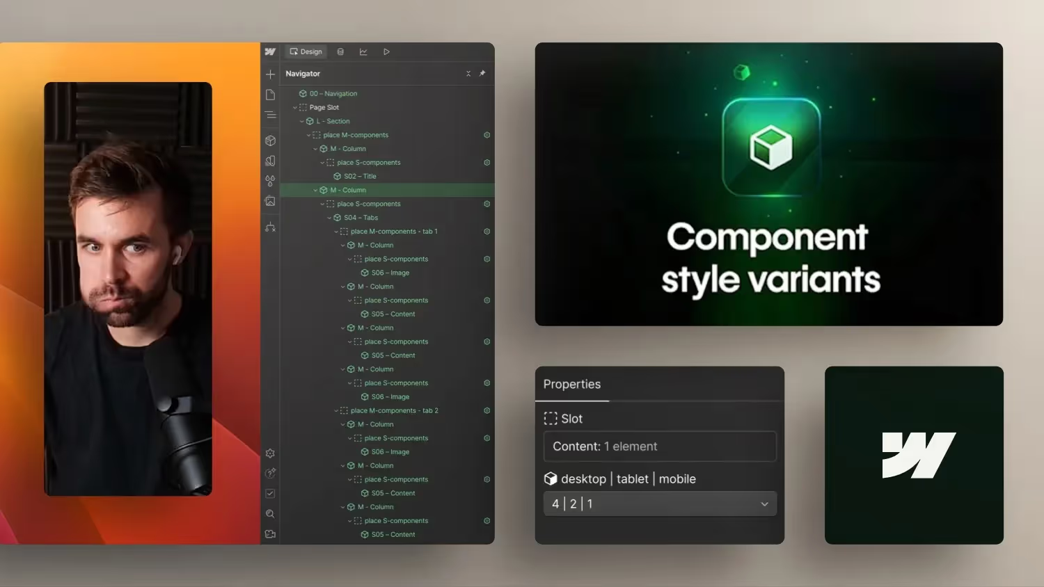

Discover the new possibilities of Webflow Component Variants in Deep Dive! In this video, I'll show you how to make your design processes more efficient and flexible with variants in components. We compare conventional methods with the new features and provide practical tips for use.
Webflow component variants: More efficient web design through new features
In the world of web design, efficiency is the key to success. The new Component variants in Webflowoffer just that: a way to make designs more flexible while keeping the structure clean.
The challenge with previous methods
Until now, it was necessary to create multiple duplicates or work with visibility settings for different states of a component. That led to:
- Redundant code
- Confusing structures
- More effort when making changes
What are component variants?
With component variants, you can manage different states within a single component. For example:
- Change text orientation: Simply switch between “Left” and “Center” or “Right.”
- Show or hide items: Determine which content is visible in which variant.
- Adjust styling: Change the design for each variant without changing the basic structure.
Benefits of the new feature
- clarity: Fewer components mean a tidier project.
- saving time: Faster adjustments without redundant elements.
- flexibility: Easy to test and implement various design ideas.
How to use component variants in Webflow
- Create base variant: Develop your components and convert them into a component.
- Add variants: Click on the variant icon within the component and create new states such as “Center.”
- Make adjustments: Change the styling or visibility of elements within the variant.
- Apply variants: When inserting the component, select the desired variant from the drop-down menu.
conclusion
Introducing component variants to Webflow brings us closer to modern front-end practices. They make it possible to work more efficiently while ensuring a flexible and clean design.



-blog.jpg)