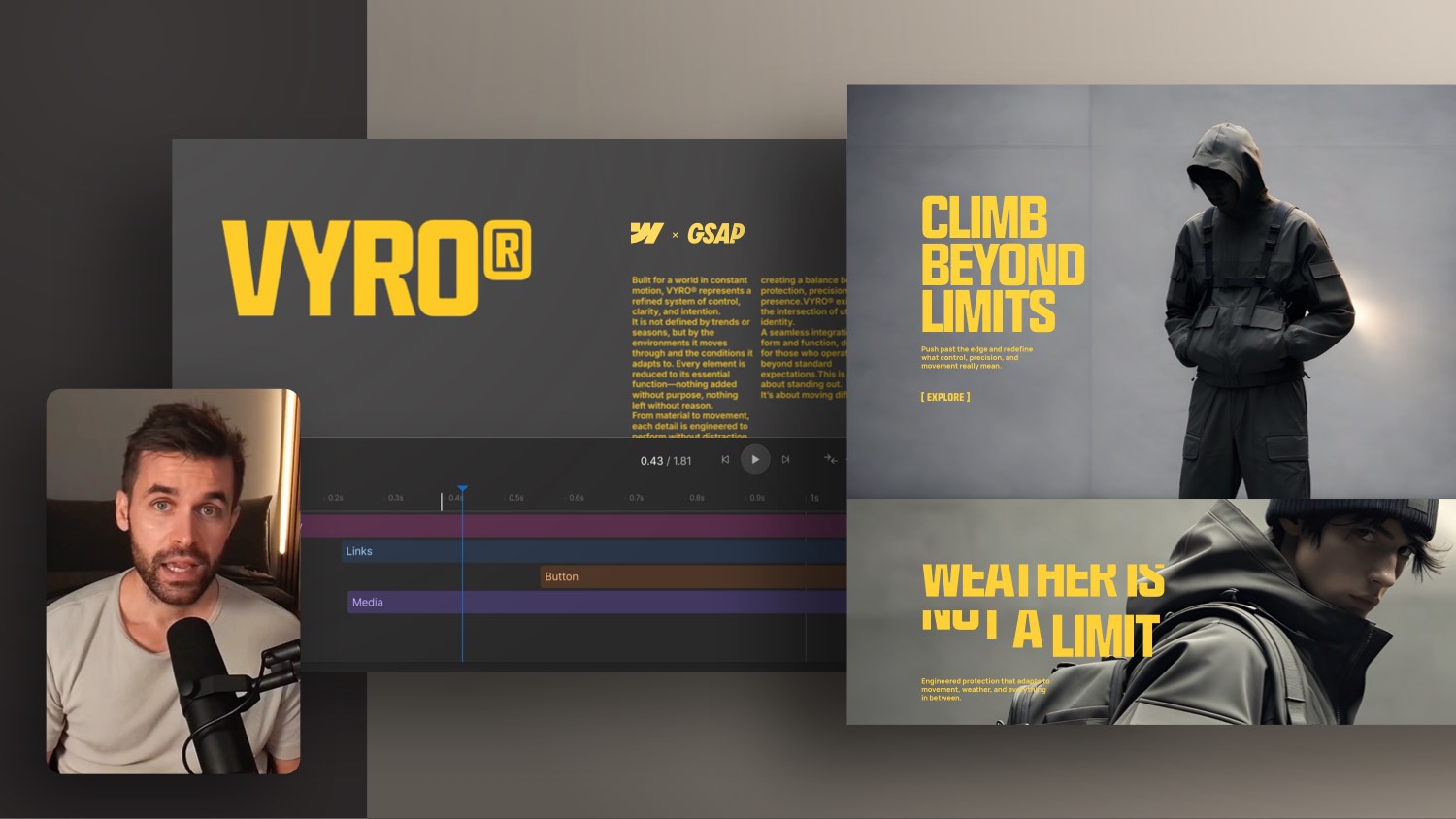
Kreative GSAP Hero Animation mit einem 3D Card Loop-Effekt


In this Webflow GSAP tutorial you learn how to animate a testimonial hero step by step, from the counter as the hero element to a looping card and text swap.
Instead of throwing every element on screen at once, you build the animation in layers: fade in the counter first, then reveal the collage, gradients and floating dots like stars, and finally loop through swapping cards and line by line text reveals. You also learn how to use a scroll trigger on the counter, why pausing on leave is better for performance, and how to fake a real 3D perspective directly in the GSAP UI.
Everything is built visually in the Webflow Designer with GSAP, so you can rebuild it on your own site right away. If you want to go deeper into GSAP and Webflow, check out the Webflow GSAP Interactions Masterclass.
Why a hero section should be animated in layers
Before you animate a hero section like this one, it always pays to take a step back. The key question is: what is the hero of this animation, and in which order should the other elements come into play? In this example there is already a counter up animation, meaning a number that counts upward. That is the first thing a user sees the moment the section scrolls into the viewport.
When a lot happens right at the start, you should pace the rest deliberately. Instead of fading everything in at once, you build the animation in this order:
- First the counter as a clear focal point
- Then the collage and the images
- Next the gradients in the background
- After that the little dots that appear like stars
- Finally the loop, in which cards and text swap through
This creates a flow that does not feel overloaded but builds tension step by step.
Choosing the right trigger
Normally you use the section itself as the trigger, meaning the moment it enters the viewport. In this case, however, the user counter is the better choice. Create a new scroll interaction and name it something like user hero.
The class user counter is already set in the scroll trigger. You do not want a scroll bound animation here, only to trigger timeline actions. Define the behavior like this:
- On entering the viewport it plays
- On leaving it pauses, which is better for performance
- When scrolling back up the animation resumes
- On leaving again it pauses once more
Fading in the counter
As the first action you fade in all elements of the counter. As the target you choose not all nested elements but only the direct children via the direct child of option. That way you cleanly animate only the columns and the button, not every single element inside.
Pay attention to these settings:
- Start from an opacity of zero back to the state defined in the Designer
- Set an offset time of about 50 to 80 milliseconds for a stagger effect
- Use a
power1easing for fade ins, it feels especially soft - Choose a duration of around one second for a pleasantly calm timing
Collage, gradients and dots
Next up are collage, gradients and dots. You treat these three layers slightly differently:
- Collage: instead of using the class
user collagedirectly, you target theuser grid wrapperso the images fade in cleanly. - Gradients: do not animate the image itself but the wrapper around the gradient image. That way there is no conflict with the movements already applied to the image. Use the class
fb-shape-image-wrap, filter via the section with the combo classcc-user, and let the animation run slowly, about five seconds with apower3easing. - Dots: target their wrapper and animate from opacity zero with a scale from zero to one, and they appear like little stars. An offset time of around 80 milliseconds creates a nice stagger effect.
Swapping cards with a second collection
So the hero section does not just fade in once but stays alive, you need a second card collection. Proceed like this:
- Duplicate the existing
user grid list wrapper 1and name the copywrapper 2 - Set
wrapper 2toposition absoluteso it sits directly on top of the first list - Set the filter so the second list skips eight instead of four items, so different images appear
- Set the second wrapper to
pointer-events noneand reduce the opacity, since nothing needs to be clickable here
Faking a real 3D perspective
The actual image swap is where it gets exciting. You animate the images of the first list out and those of the second in, for example with a rotation around the X axis combined with a slight move and scale.
For the rotation to look realistic, you need a 3D perspective. You can set this directly in the GSAP UI instead of defining it in the Webflow Designer under Transform. Keep in mind:
- Add a perspective of about
1000pixels as the default state - Without this value the rotation looks flat and unnatural
- For more character you can test an
elasticcurve as easing
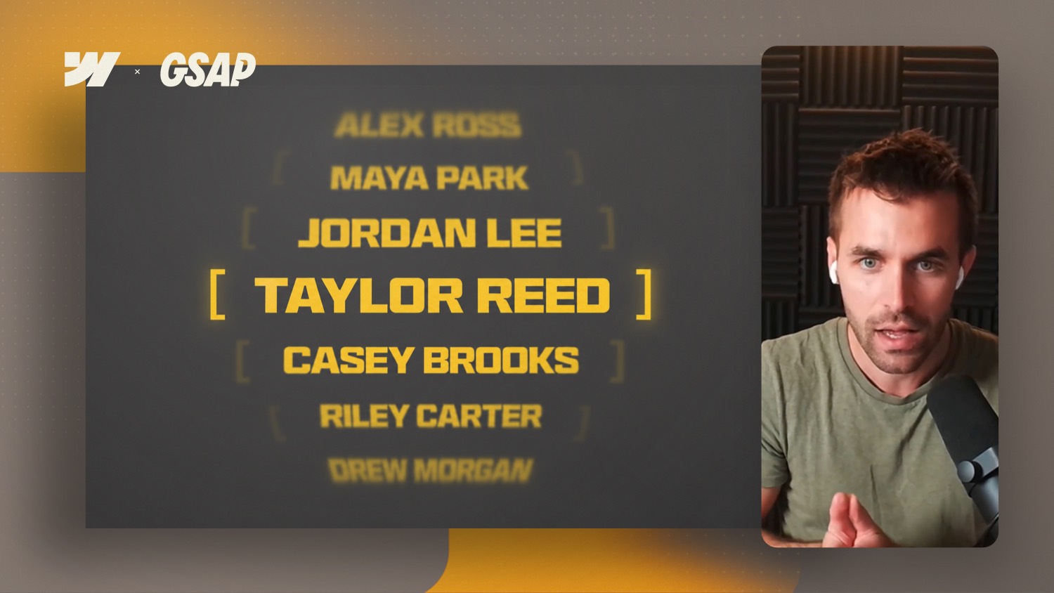
Revealing text line by line
A clean stagger works well for the text elements. Split the text by lines and mask it by lines as well. Watch these values:
- Animate from zero to minus 110 percent for an elegant line by line effect
- Use a very short stagger of about 25 milliseconds for a fast timing
- Set the starting point deliberately to the fourth item, since only four items per collection list are visible
By default the stagger runs from left to right. But you can also start from the center, the edges or at random to make the effect feel more lively.
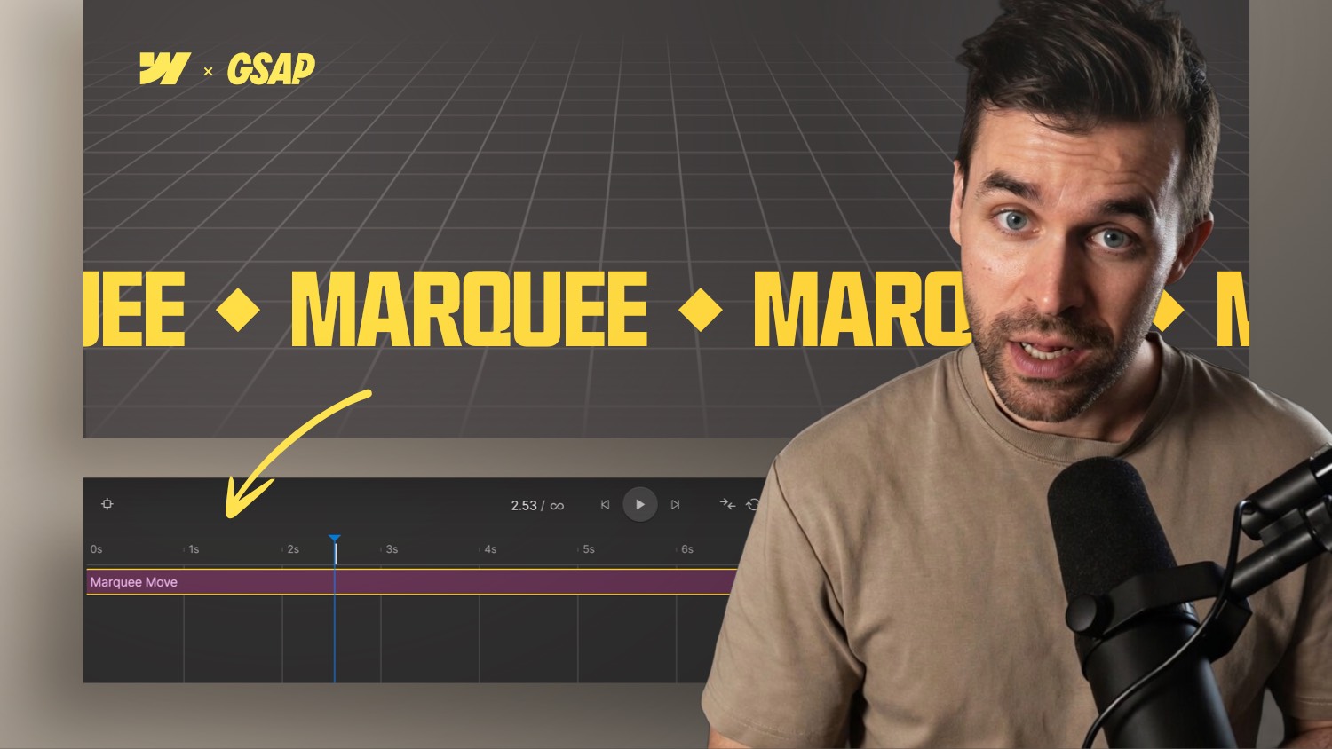
The animation as an infinite loop
In the end the whole sequence should run as an infinite loop as long as the section is in the viewport. The obvious solution, simply setting the entire animation to repeat infinite, does not work here, because the first fade in of all elements would repeat as well.
The cleanest way looks like this:
- Duplicate the animation and disable the initial fade ins in the copy
- Keep only the swap of cards and text
- Set a pause of around four seconds between the swaps
- Alternate between
wrapper 1andwrapper 2 - Set this loop animation to
loopso the section keeps swapping elegantly

-blog.jpg)