
I Designed This in Figma. Can Claude Build It?
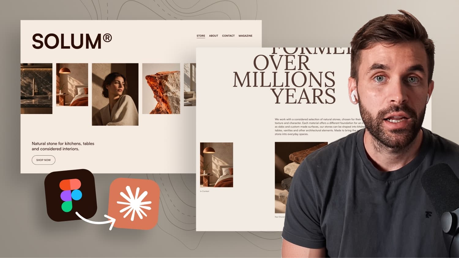

I designed a website for a fictional natural stone brand in Figma. Then I gave the design to Claude to see how well AI can turn a custom designed into a real website. The layout has an asymmetric grid, different image sizes, a full-width marquee, large serif typography, intentional whitespace and GSAP animations.
No Figma MCP. No plugins. Just the design, the assets and one detailed master prompt.
I score the result area by area and show what Claude gets right on the first try, where it struggles and how I fix the remaining issues.
In this video:
- My Figma design and visual direction
- The master prompt I used
- Claude’s first result
- Scorecard: what worked on the first try
- Fixing the animations
Free code files — no signup: Downloads
Can AI build a design it did not create?
Most AI website tools work the other way around. You describe an idea and the AI decides what the page should look like. For a designer, that is the least interesting part to hand over. The design, the image rhythm and the idea behind each animation are exactly the decisions you want to keep.
So this test asks a different question: can you design an individual website in Figma, make every visual decision yourself, and then let Claude turn that exact design into a real animated website? No Figma MCP, no plugin, no paid Figma plan. Claude only gets a screenshot of the layout, the fonts, the images and one well structured master prompt.
The design concept for SOLUM
The test project is SOLUM, a fictional brand that works with natural stone and creates kitchen surfaces, tables and interior elements. The visual direction started with a small mood board in Figma, built mostly from Pinterest research. One idea stood out: showing stone almost like a sculpture instead of only showing finished products.
For typography, two free fonts from Fontshare do the job. Satoshi is the clean sans serif for the interface and body copy, and Lora is the serif for the large editorial headlines.
Two calmer layout directions were also on the table, and both would work for a client. For this test they felt too normal. The final version has asymmetric layouts, images in different sizes and vertical positions, a full width marquee, oversized typography and a lot of white space. In short: a harder job for Claude.
Grid and image rhythm
The desktop design is based on a 12 column grid with 80 pixel margins and 24 pixel gutters. That grid pays off later, because you can give precise corrections like "start at column six and span five columns" instead of "move it a bit to the left".
The images were generated as a larger selection first and then arranged by hand. Instead of six product shots in a row, the sequence mixes close ups, wider shots, raw materials and people. That rhythm is still a very human decision, where taste and experience matter.
Preparing the project folder
The setup is simple. One project folder on the desktop contains:
- A folder with the font families for Satoshi and Lora
- An images folder with a subfolder called
slider-images, numbered from one to eight - A second image folder for the three images in the section below
- A full desktop export of the Figma layout as the main visual reference
- A second screenshot with the Figma grid turned on for column alignment
The slider folder holds two more images than the Figma layout shows. That is on purpose, to see how Claude handles extra assets.
In Claude, switch from chat to code, start a new project and select this folder. Claude can now work directly with your local files.
How the master prompt is structured
Since Claude has no access to your Figma layers, the quality of the instructions decides the result. The master prompt is split into clear sections.
Goal
The goal explains what you are building and how it should feel: a premium natural stone website that is editorial, minimal and refined. The screenshot shows what the page looks like. The goal explains why.
Design reference
This is the most important rule. Image one is defined as the source of truth for composition, proportions, spacing, typography, image placement and white space. One sentence makes the difference: if anything in the written instructions is missing or conflicts with the reference, the reference image wins. Your prompt will never describe every detail, so Claude should look at the design instead of inventing a new solution.
Design system
Here you give Claude what a screenshot cannot show. The page uses two colors, a dark brown #270F05 for text and a warm off white #F2EBE3 for the background. Each text style gets exact values, for example Lora Regular at 115 pixels for the large headline and Satoshi Medium at 22 pixels with 70% opacity for body copy. Without that opacity value, Claude would probably sample a lighter color, which is not how the design is built.
The prompt also asks for rem as the main unit and clamp() for fluid scaling instead of copying fixed pixel values from Figma.
Animations
The animations are described in the first prompt, because some of them affect the page structure. Every image reveals with a small upward movement and a fade. Grouped images use a short stagger. The hero marquee moves slowly to the left, speeds up when you scroll, never changes direction and eases back to its base speed once scrolling stops. Large headlines reveal line by line with a 50 millisecond stagger.
The result after 12 minutes
Claude finished in about 12 minutes. Building this by hand would take around two hours.
Claude created its own assets folder, converted all images to WebP in multiple sizes and kept the originals. The stack is exactly what the prompt asked for: one HTML file, one CSS file, one JavaScript file and GSAP.
A few things needed fine tuning. The page fade in and the image stagger felt too slow, the hero button only appeared after scrolling, and the marquee sped up too much on scroll up. The container also had no max width, so it did not match the Figma artboard. After adding a max width of 1728 pixels with margin: 0 auto, the headline broke into five lines, exactly like in Figma.
The scorecard
Claude passed all nine areas of the test:
- Layout and asymmetry match the design
- The image row keeps different sizes and positions
- Typography uses the right fonts and stores the 70% opacity in a CSS variable
- All eight slider images are in the marquee, not only the six from the layout
- The marquee moves in the right direction and speeds up on scroll
- Headlines reveal line by line
- Tablet and mobile work well without any mobile design, and the tablet marquee even reduces to three images
- The code uses clean class names, CSS variables,
remandclamp() prefers-reduced-motionreplaces the marquee movement with a soft fade, and there is a skip link for keyboard users
Passed does not mean finished, though. One feedback prompt fixed the container, the page load timing, the reveal order and the marquee speed on smaller screens. After that, all animations felt on point.
What this means for real client projects
This was one page in a controlled setup with a finished design, images, fonts and a clear direction. A real client website needs much more: multiple pages, CMS content, forms, hosting, SEO, privacy and client editing. That is still where a platform like Webflow does the heavy lifting.
The interesting workflow is not replacing design with AI. It is keeping the creative decisions and using AI where it makes the implementation faster or better. The next test goes one step further with a custom scroll animation for the stone section.

-blog.jpg)