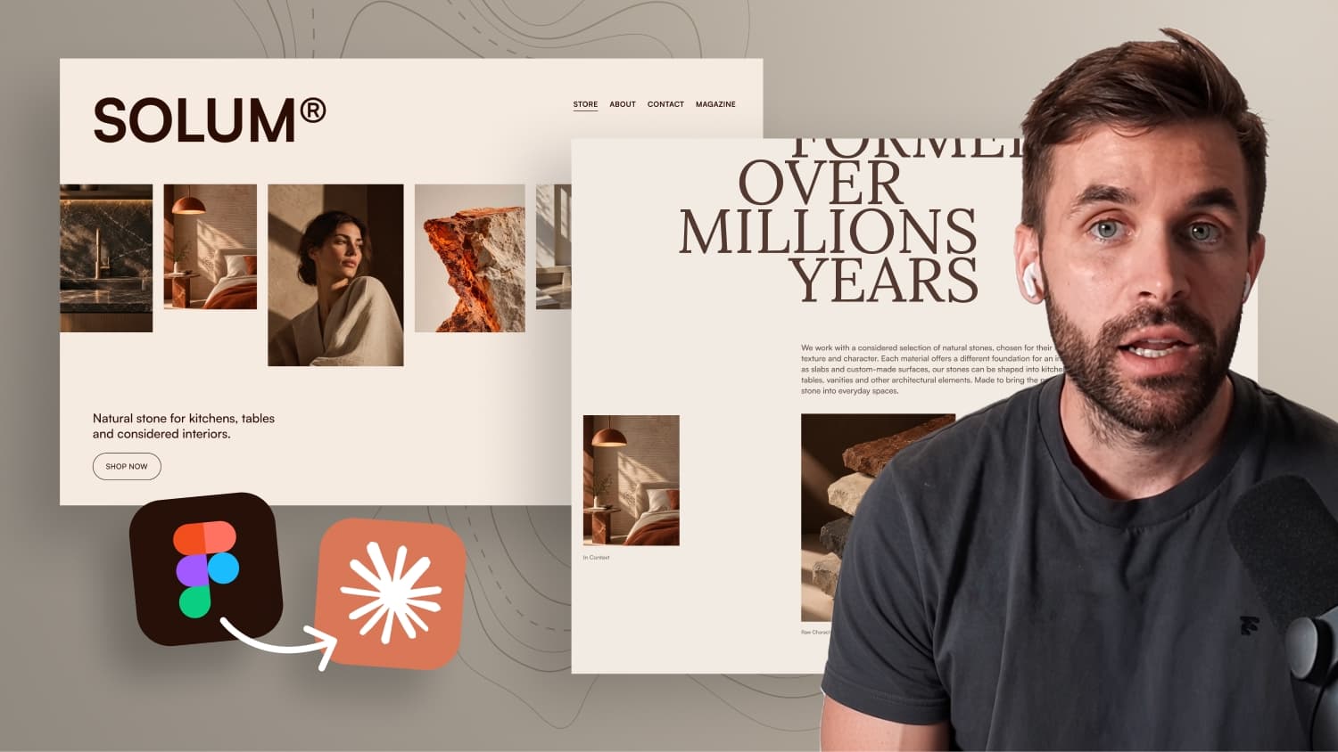
I Tested Figma MCP vs Screenshots With Claude Code

Is the Figma MCP worth it? I tested it in Claude Code against my detailed screenshot prompt, and the result surprised me.
In my last video, Claude Code built a complex website from my Figma screenshots in 48 minutes, including an infinite slider, animated artist overlays, and a preloader. However, the prompt alone was 2,646 words long. That’s why this time I compared three workflows directly: screenshots with a detailed master prompt, the Figma MCP with a minimal prompt, and the Figma MCP with a short prompt focused on animations.
In this video, you will learn:
- How the Figma MCP differs from working with screenshots
- How to copy links to Figma artboards in Dev Mode
- The speed, design accuracy, and animation quality of all three workflows
- What the Figma MCP costs and how many tool calls you actually need
Figma MCP or screenshots: what works better with Claude Code?
In my last video, Claude Code built a complete website from my Figma design: an infinite slider, animated artist profiles, a preloader and a hover interaction for a genre list. The first result took about 48 minutes with Claude Opus 5.5 on high, plus one feedback prompt to fix a few smaller issues.
The catch: my original prompt had 2,646 words. I dictated most of it and let Claude write the final version, but you still need a detailed, well structured prompt to get results like this from screenshots.
In the comments, quite a few people asked why I am not using the Figma MCP server instead. Good question. With the MCP, Claude reads the actual design data directly from Figma, so in theory you should not need to describe as many details in your prompt. But does that really work, and is it worth paying for? That is what this side by side test is about.
Screenshots vs Figma MCP: the difference
In my previous tests, I exported the Figma layouts as images and added them to the Claude Code project, including a version with the 12 column grid visible. Together with my instructions, Claude recreated the designs almost pixel perfect.
But from a screenshot, Claude still has to figure out spacing, font sizes and how elements are positioned. It also cannot always tell whether an element has reduced opacity or simply uses a different color. You can explain all of this in your prompt, but on larger projects that gets time consuming.
With the Figma MCP, Claude can access the actual design structure:
- Dimensions and layout information
- Typography and variables
- Assets, which it can download, convert to WebP and save in a folder for you
- Screenshots taken directly from your Figma artboards, so you do not have to export anything yourself
One thing is worth mentioning though: you do not need the Figma MCP to build websites with Claude Code. Screenshots work really well, and you can even design in completely different tools.
The test setup
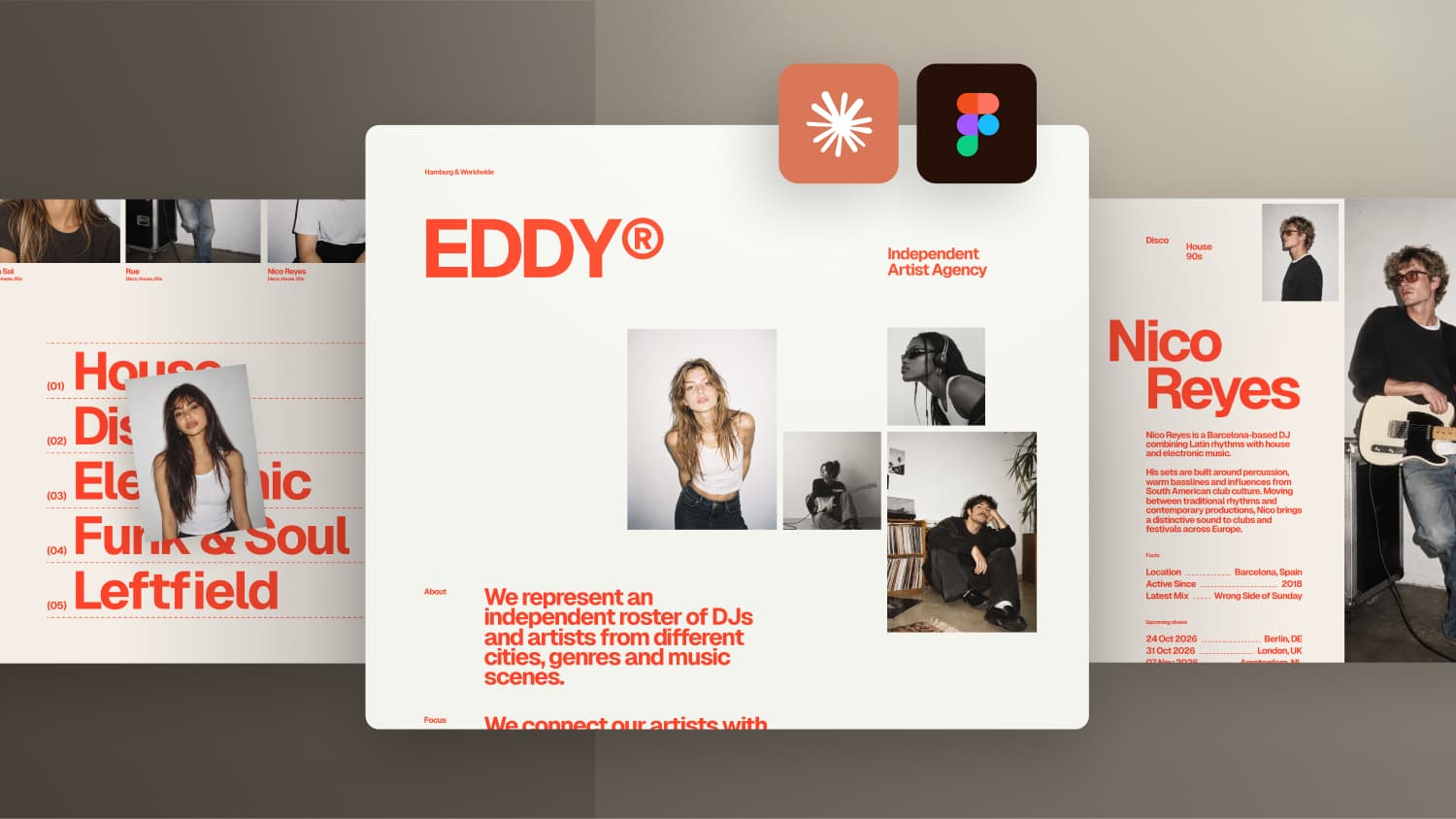
For this experiment I used the EDDY website from my last video and compared three approaches:
- Reference: screenshots, a detailed master prompt and one feedback prompt. About 48 minutes for the first result.
- Figma MCP with a minimal prompt: only the links to the Figma layouts and a few basic notes on how they are connected. No instructions about animations.
- Figma MCP with a short prompt: the technical setup and the animation instructions, but none of the detailed layout instructions like colors, spacing or typography.
Both MCP tests used the same model and fresh project folders.
How to copy a Figma artboard link
Select an artboard in Figma and press Shift + D to switch to Dev Mode. On the right side you will find a small link icon that copies the URL of exactly this artboard. You can paste this link directly into your prompt in Claude Code.
Test 1: Figma MCP with a minimal prompt
Claude finished in about 10 minutes, much faster than the 48 minutes of the screenshot workflow. Of course, this version misses the more complex interactions, so it is not a completely fair comparison. Still, the build quality was good.
Images and texts were almost exactly where they should be. I checked this by placing a screenshot of the result over the original Figma artboard at 1728px with the difference blend mode. Black areas show matching pixels, everything else reveals the differences.
One issue showed up when I resized the browser: the whole website scaled with the viewport width. Claude used rem for the text, which is normally a good thing, but calculated the root font size from the viewport width. On large screens everything keeps growing, and zooming with the keyboard no longer makes the text bigger. That is a real accessibility problem.
The interactions were rather basic:
- The preloader only fades in the logo and slides the screen up.
- The slider is draggable, but feels stiff, is not smooth and not infinite.
- The artist overlay opens with a simple fade instead of the image transition.
- The genre hover was surprisingly good, including a small scale and fade animation, even though I never mentioned it. But the images disappear immediately when you leave a name, which causes flickering.
Test 2: Figma MCP with a short prompt
This time I added the technical setup and the animation instructions. Claude needed about 21 minutes, still much faster than the reference.
The letter by letter preloader worked, but the letter spacing suddenly changed when the logo moved into its final position. In fact, the letter spacing was slightly off across the whole site, even though Claude had access to the Figma values.
The slider now had autoplay, but jumped from artist to artist instead of moving continuously. It also had the same issues as my original first result: it did not extend across the full screen and the parallax images jumped after dragging.
The biggest surprise was the artist overlay. The image did not transition smoothly from the slider and jumped when closing. With the detailed screenshot prompt, Claude got this right on the first attempt. The genre hover looked nice, but the image followed the cursor instead of staying on the left, and all artist names faded out instead of only the ones in the same row.
Comparing all three results
In terms of design, all three versions came pretty close to the original Figma layout. For the interactions, the detailed screenshot prompt clearly worked better, especially the infinite slider and the smooth transition into the artist overlay.
In terms of speed, the MCP versions were definitely faster. Keep in mind that these are only first results and all three would still need some feedback rounds.
What does the Figma MCP cost?
You can use the remote Figma MCP for free, but you are limited to 20 tool calls per month. In my test, Claude used five tool calls for a single prompt, so you will hit that limit quickly.
For regular use you will probably need a paid plan. You do not need a full seat though: a Dev seat on the Professional plan costs about 15 dollars per month and gives you up to 200 tool calls per day, which should be enough for most projects.
My conclusion
Giving Claude direct access to my design files did not automatically lead to a better result. My screenshot workflow handled the complex animations much better. The biggest advantage of the MCP is time, which becomes especially interesting for larger websites with multiple pages.
But the test also showed that a good prompt is still incredibly important, especially for responsive behavior, animations and all the small details that make a website feel good. For me, the Figma MCP is not a replacement for a good prompt. It is another tool that can make the process a little easier.