How to Build Unique CMS Grids in Webflow
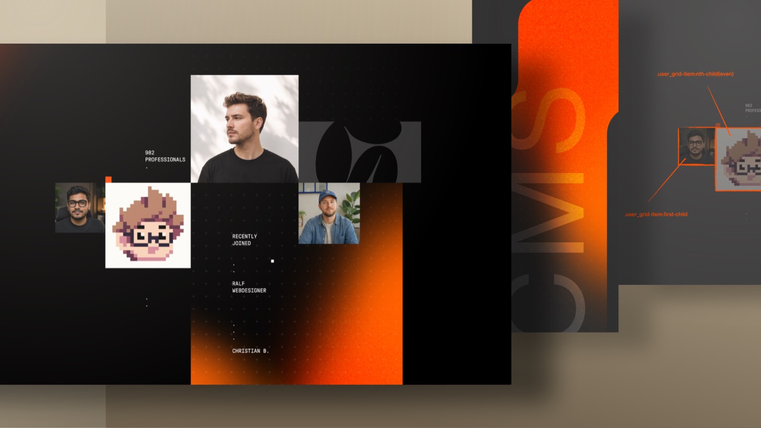

Ever wanted a CMS grid that looks fully custom but still pulls faces straight from your collection? In this Webflow tutorial you build exactly that: an individual, hard-to-fake layout that most AI tools struggle with.
You learn how to connect a testimonial collection list, target single items with nth-child logic right inside the Webflow Designer (almost no custom code), and make everything scale perfectly with container query units. The result is a responsive grid that keeps its proportions on tablet and mobile without endless breakpoint tweaking.
A CMS Grid That Looks Custom but Stays Dynamic
Some layouts are hard to fake. This testimonial grid is exactly that kind of design: an individual, slightly irregular arrangement of faces that most AI tools struggle to rebuild. And that is precisely why it works so well on your own page. It looks handcrafted, yet every image is pulled straight from a CMS collection. Whenever a new testimonial goes live, a new face automatically shows up in the grid.
In this tutorial you build that layout together with me. The goal is a grid that hits three things at once:
- It feels fully custom and hard to copy
- It stays dynamic through the CMS
- It scales cleanly from desktop down to mobile without endless breakpoint work
Setting Up the Collection List
The foundation is a collection list, not static images. The structure is quick to set up:
- Inside your container, add a wrapping div, for example
user-collage - Add a
user-grid-wrapperdiv inside it - Place your collection list in the wrapper and connect it to your testimonials
- Add an image element, give it a class like
user-grid-item-image, and connect it to the CMS image field
Then tune the collection list itself so only the right items show up:
- Filter so only items with an image are visible
- Sort by created date from newest to oldest
- Limit the list to four items, since the design has four images
Styling Single Items Without Heavy Custom Code
Here comes the real challenge. Webflow does not let you reorder or manually style individual items inside a collection list. Every item shares the same class, so you cannot just grab the second one and make it bigger.
If you are into custom code, you already know that CSS can target the first, the odd, the even and the last element in a group. Normally that means a bit of custom CSS. But because there are only four images here, you can do most of it directly in the Webflow Designer.
Start by setting flexbox on the list element and giving each user-grid-item a width based on em units. Take one reference size, for example 192 divided by 16, and use em everywhere. Then open the width dropdown on the item and target each state individually:
- First item gets a smaller value so it sits tighter
- Even item (the second one) gets its own width
- Odd items get pushed up so the third one sits higher
- Last item gets a separate width to finish the irregular look
With that alone you recreate the designed, slightly uneven arrangement, all inside the Designer.
Names, Professions and Conditional Badges
The layout is more than images. Each item also carries a name, a profession and sometimes a badge text. Wrap a text element in a div, use a global class like infotext so it stays small, and add some percentage based padding on the left and right.
Because not every testimonial has a badge, use conditional visibility. Set it up so:
- The badge text only shows when the badge field is actually filled
- The separator dot in front of it follows the same condition
That keeps the design clean and avoids empty dots or dashes floating around.
Reusing a Gradient Shape Component
The gradient shape behind the grid is not built from scratch. It is a component reused across the whole site. Drop it in, set the grid list to position relative so the shape sits correctly, and give the shape a unique name like user-top so you can move, rotate and flip it freely.
The nice part is how flexible this component is:
- The same gradient works everywhere and can be rotated or flipped
- Different SVG shapes from the Formburg logo are swapped in per placement
- Those shapes are converted into a CSS mask in the background
That gives you a powerful, reusable custom component without rebuilding it every time.
Making It Scale With Container Query Units
This is the part that makes the whole layout feel effortless. As long as the images use em, they do not scale when the viewport shrinks, only the gradient does. The fix is container query units:
- On the
user-grid-wrapper, set the custom propertycontainer-typeto inline size - Override the font size on that same wrapper
- Instead of the body font size, connect it to one container query width, so one unit equals one percent of the wrapper
Now every image using em scales in proportion to the container itself. Shrink the viewport and the entire grid scales down as one piece, images and gradient together. Want everything a bit larger? Just bump the base font size to 1.5 and the whole grid grows, while the info text keeps its own size because it does not depend on that unit.
Top Elements, Counter and Hidden Items
The top area reuses the same structure without the collection list. Add a plain div with the user-grid-list class so it inherits the same CSS, then duplicate items to match the sizes. A dot component with an accent variant adds the small red signal dot, kept in fixed pixels so it never scales.
The counter and the hidden items need a bit more care:
- Use a span with your dynamic member attribute so the real number of attendees is always shown
- Hide the extra text elements with a small code embed
- Set those elements to position absolute so they no longer push the content flow
- Reveal only the item you want using
w-dyn-itemwith an nth-child target like the third child
Bottom Collage and Random Dots
The bottom collage is basically a duplicate of the top one with a few combo classes. To reposition it:
- Add a
cc-bottomclass to move the grid to the bottom left - Flip the sizing values for the items so the arrangement differs from the top
- Swap the gradient shape for the bottom variant
Finally, scatter a few absolutely positioned dots across the section. Use a wrapper with pointer events none, place the dots in a grid row using your framework columns, and nudge them with negative margins. These little details are what push the layout from good to polished.
Fast Responsiveness Thanks to Scalable Units
Because everything already relies on scalable units, the responsive work is minimal. On tablet and mobile you only need a few tweaks:
- Switch the wrapper unit from container query width to vw, since one vw behaves almost like one container query width when the container is full width
- Bump it to around 2vw so the grid gets a bit larger on smaller screens
- Reposition the gradient shapes for each breakpoint
- Hide the tiny detail dots on mobile where space is tight
That is the entire structure done. A unique, CMS driven grid that scales cleanly across breakpoints with barely any custom code. In the next tutorial you add a custom GSAP animation on top of this layout, so the faces animate in and out for that extra bit of life.

-blog.avif)