Super Easy Sticky Title Scroll Animation in Webflow


In this Webflow tutorial, I’ll show you how to create a scroll animation that reveals a large title behind a section as you scroll. Step by step, you’ll learn how to build this effect using the new Webflow GSAP interactions – including Y-position settings, timing tweaks, and container query units. A quick and powerful way to add visual interest to your layouts!
Scroll Animation in Webflow: Reveal a Title Behind a Section
A scroll animation can often be the subtle difference that turns good design into great design. In this quick Webflow tutorial, I’ll show you how to reveal a large title behind a section as the user scrolls – a visually impressive trick that’s surprisingly easy to build.
The Idea Behind the Effect
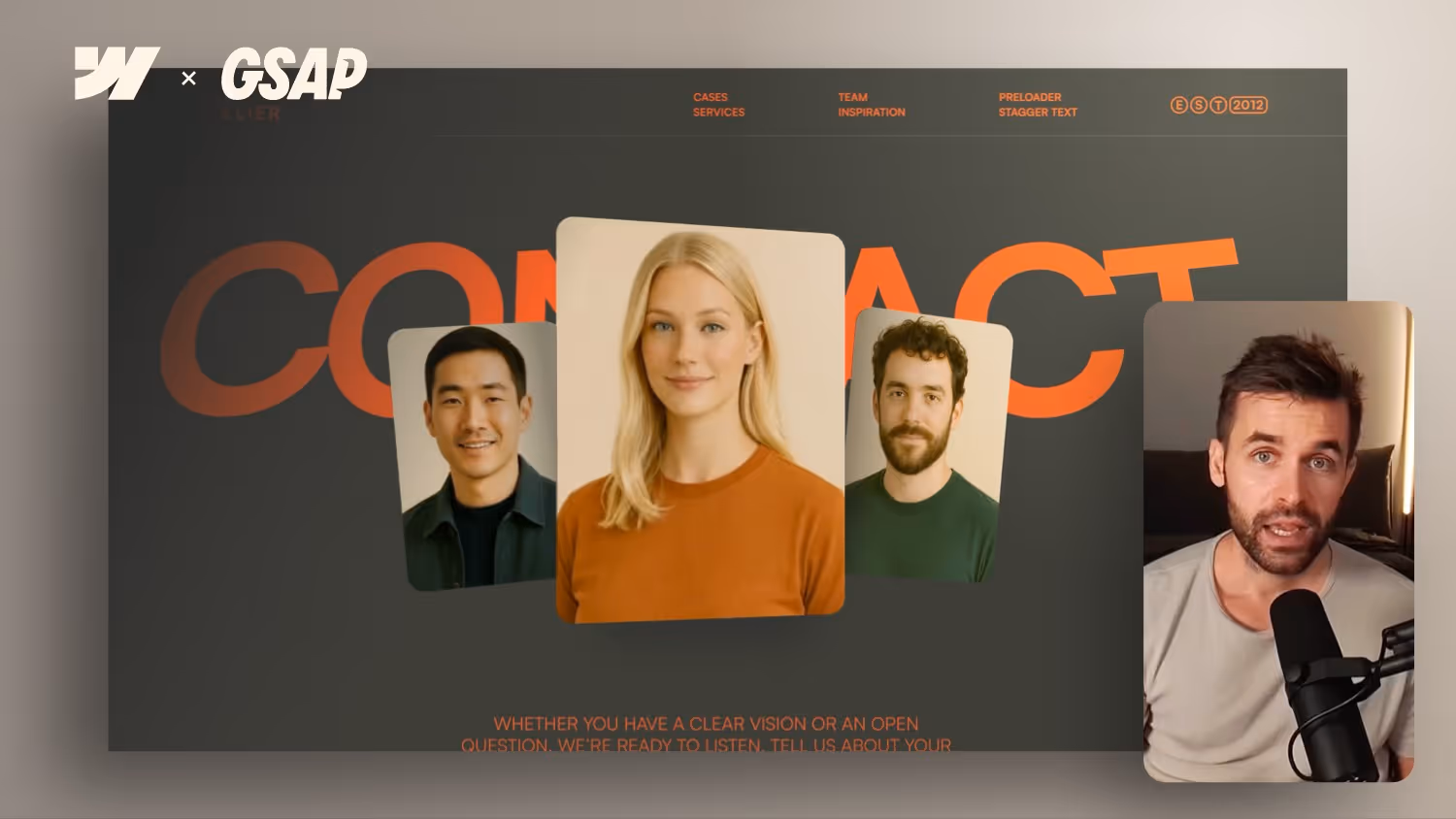
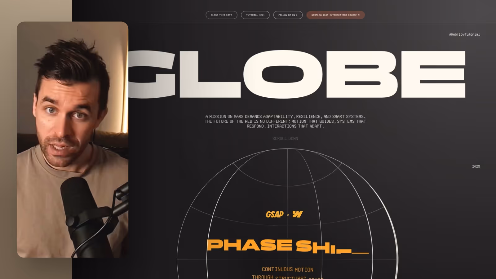
The animation leverages scrolling to push a large title upward while a new section enters the viewport. This creates the illusion that the title emerges from behind the background. It's perfect between content blocks or to introduce a new section.
Step-by-Step Instructions
Start by selecting the title element (or its wrapper). Then go into Interactions and create a new Scroll Animation. Set the initial Y-position to –110% and animate it to its designed position.
Next, adjust the scroll trigger endpoint – for example, from 100% to 70% of the viewport height – so the animation finishes earlier.
You can also disable smoothness to match the scroll speed of the dark background section, enhancing the illusion that the section covers the title.
To make the animation smoother, add a short delay and set the duration to around 0.5 seconds. This creates nice spacing as the title fully enters the viewport.
Bonus: Container Queries for Scalable Titles
To make the title responsive and stop scaling at a certain container width, apply a combo class to the container (e.g., container-type-inline-size) and use container-type: inline-size in the custom properties settings. Then set the text element to use container query width as the unit.
This allows the title to scale like a vw unit, but stop once the container reaches its max width – perfect for flexible layouts.
Conclusion
This scroll animation is simple yet powerful. It adds movement and layering to your layout, making transitions between sections more engaging.