3D Line Globe Scroll Effect — Made with Webflow + GSAP
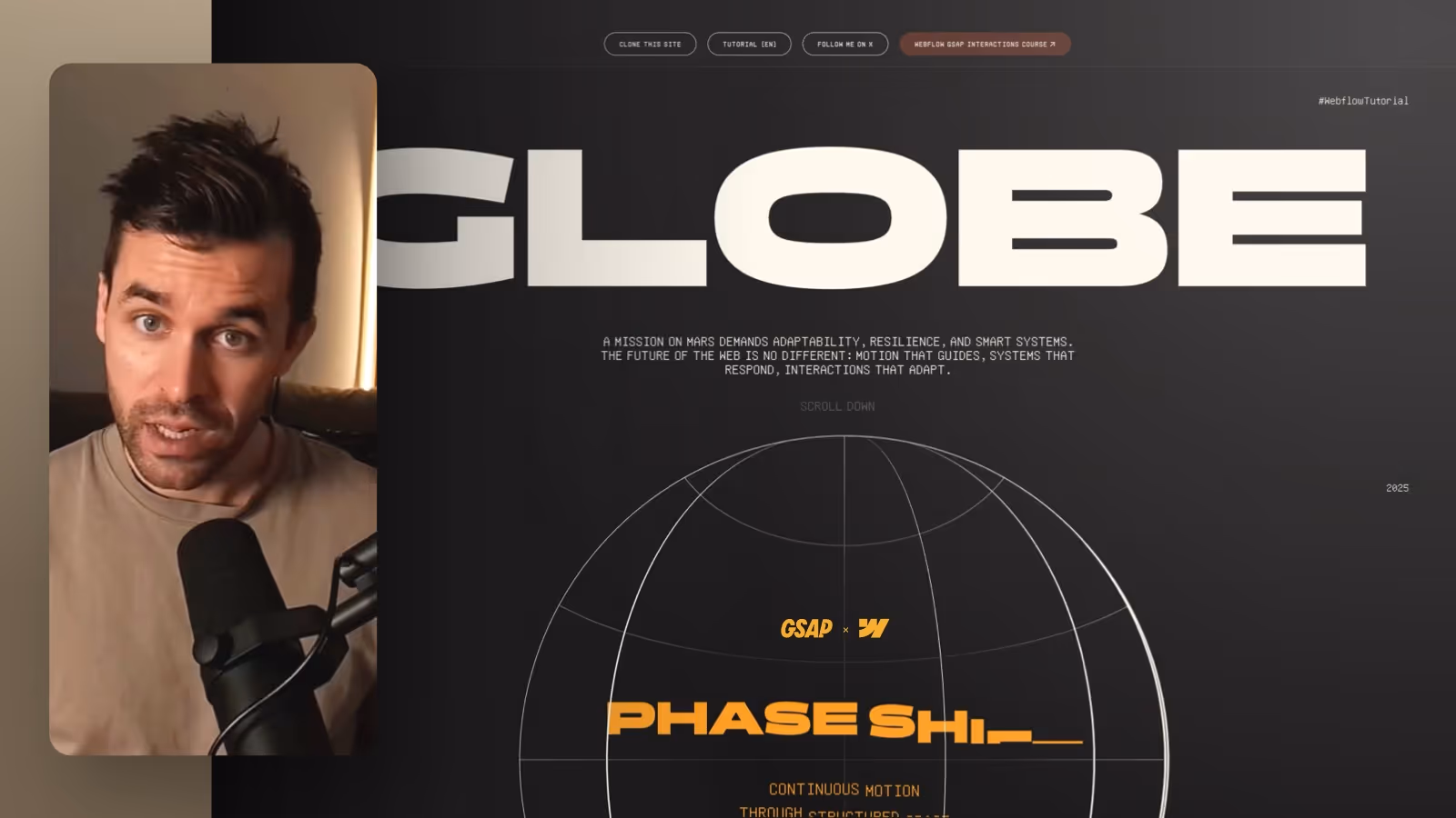

In this Webflow tutorial, I’ll show you how to build a scroll-triggered 3D globe rotation animation using the new GSAP timeline integration directly inside the Webflow Designer. We’ll go through structure, setup, styling, and the GSAP scroll animation step by step—from the orbit wrapper to animating lines and text. This tutorial is ideal for designers who want to truly understand advanced, scroll-based motion systems in Webflow.
Build a 3D Globe Scroll Animation in Webflow with the GSAP Timeline
In this post, I’ll walk you through the setup and the most important steps—including the key trick that prevents the vertical lines from being visible “in the back.”
The Base Setup: Orbit Section + Sticky Wrapper
To make the animation run cleanly over a defined scroll distance, you need a dedicated section that controls the duration.
- Add a new section directly after your stage and name it
Orbit Section. - Set the section height to
400vh. This is the scroll distance for your animation. - Set the background to your dark page background (e.g.
background dark).
Inside it, add an Orbit Sticky Wrapper:
- Width:
100% - Height:
100vh position: stickyandtop: 0- Center the content (e.g. using Flex)
This keeps the globe in the viewport while you scroll through the 400vh section.
The Globe: Orbit Wrapper as a Circle with Overflow Hidden
Inside the sticky wrapper, place the element that defines the globe:
Orbit Wrapper
- Width:
40%and Height:40%(same size) - Border:
1pxin a bright color - Border radius:
50% overflow: hiddenposition: relative(important for absolutely positioned children)
Now you have a clean circular canvas where your lines can live.
Vertical Lines: the “Front Only” Trick to Avoid Backside Lines
This is the part that makes the whole thing actually feel 3D.
- Add an
Orbit Vertical Line Wrapper(100% width/height,position: absolute, all edges set to0). - Inside it, add the actual
Orbit Vertical Lineand set it to “Fill” (absolute, full size).
The common mistake is giving this element a full border on all sides. That makes the line visible both in the front and the back. It can look cool, but it’s the wrong look for this scroll animation.
The solution:
For the vertical line, don’t use a border on all sides—use only the left border:
- Remove the full border
- Set the left border to
1–2px - Color: bright/light
This makes the lines appear “front only,” similar to Spotify’s implementation.
Enable 3D Depth: preserve-3d and Child Distance
To make rotations feel truly spatial:
- On the
Orbit Wrapper, set the Child Distance in the 3D options (e.g.120em). - Set
transform-styleon theOrbit Wrappertopreserve-3d. - Do the same for the vertical line so it renders correctly in 3D space.
Now you can arrange individual vertical lines via rotation so they feel like a real 3D object.
Horizontal Lines for the Globe Look
For the horizontal look, duplicate a vertical line and separate it as an Orbit Horizontal Line.
Unlike the vertical lines, the horizontal lines need borders on all sides so they read as full ellipses:
- Border: e.g.
1px - Border radius:
50%
For more “globe depth,” you typically add multiple horizontal lines:
- one center line with no radius—just a thin stroke (use a background instead of a border)
- a top and bottom ellipse with stronger curvature (slightly adjust width/position)
This gives the globe its signature “grid” look.
Create the Scroll Animation: GSAP Timeline with Scrub on Scroll
Now the animation happens directly in Webflow:
- Select the
Orbit Section. - Create a new scroll interaction (e.g.
3D globe scroll animation). - Enable Scrub on Scroll so the timeline is tied to the scroll position.
That turns your section into the “trigger distance”—which is exactly why 400vh matters.
Rotate Vertical Lines Sequentially (Offset + Linear)
You don’t want all lines rotating at once—you want them stepping through one by one.
- Select an
Orbit Vertical Linein a timeline step. - Set the target to Class so it targets all lines inside the orbit section.
- Add an Offset (e.g.
1sor0.5s) so they animate sequentially. - Easing:
Linear - Rotation: from
0to180deg
Now the lines travel from left to right across the globe—and thanks to the border trick, they stay visually “front-facing.”
Globe Scale Like Spotify: Enter from Below, Then Grow
The effect instantly feels more premium if the globe doesn’t just appear, but moves into frame.
- Target:
Orbit Wrapper(as Class) - Scale: e.g. from
0.05to0.8 - Add Y movement: start at
20%down, then animate to0%
After that, scale the globe across the rest of the scroll range—e.g. up to 2.2. This feels extremely smooth, especially with Scrub.
Text Animation: Split by Letter/Word + Mask
For title and copy, use text splitting in the timeline:
Title: Split by Letter + Mask
- Start:
100%downward - End:
0% - Optional stagger/offset: e.g.
150ms - Easing: e.g.
Power In Out
Copy: Split by Word + Mask
- similar settings, just without letter split
Extra polish: duplicate the text steps near the end and animate them out upward (e.g. -100%) so the intro and outro feel clean.
Finishing Touch: Fade Out Into the Next Section
As a final step, fade the whole globe out as you transition:
- Animate
Orbit Wrapperopacity from100%to0%
This makes it disappear elegantly as you scroll into the next section.
If you want to build more interactions like this directly in Webflow, you’ll find tutorials, courses, and products around Webflow and animation on FORMBURG.